


What Happens Over Here?
Looking closely at what diagram conventions hide
It’s not easy to summarize a project this far out of most people’s experience. Handwaving and visuals help, but it’s hard to send handwaving in a newsletter. So today, I have some visuals to get things started.
The Data Market Study is about understanding how data gets from the original source to the end user, focusing on data that moves between organizations.
How we indicate what we’re ignoring
Diagrams of systems are not meant to be objective representations of everything in the systems. They sensibly focus attention on the important parts, omitting or handwaving the unimportant parts. But important and unimportant are context-dependent, and what’s omitted from one diagram may be essential in another.
All models are wrong, but some are useful.
— George Box
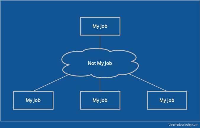
A couple of careers ago, I was working for a telecom equipment maker, and I drew many diagrams with boxes and lines. In one meeting with a computer maker, I noticed that their diagrams included clouds where we would have used boxes full of details, and they had boxes full of details where we would have used clouds. It was the same network, but from two entirely different points of view.
My takeaway was that the cloud in those diagrams said, “this part is not my job.” Or, more fairly, “this part is not what we’re here to discuss.” Clouds in diagrams are common when a network traverses an Internet connection, for example, or a software architecture uses a third-party data center. Someone else handles this part.
More recently, I recognized a more subtle way of handwaving details that aren’t the current focus: the straight line. Here’s an extremely simplified architecture for a software application that uses data from an outside source. The application could be anything: a data science platform, an end-user application, a data enrichment provider that takes outside data and adds value somehow.
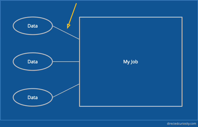
The big box is where all the details of how the system works go. The data science, the application logic, the user interfaces—all the value-adding parts of the system that it maps out. The source data, though, is just there. Something interesting just… comes into the system through the lines.
Now, that’s obviously a super-simplified hypothetical, but here’s a reference architecture for data analytics from Amazon Web Services:

The big box labeled “AWS Cloud” is—from Amazon’s perspective—My Job. It goes one level deep on how to build a data analytics system on their platforms. Interesting categories of data are on the left, linked into the diagram with lines. Data is ingested into the system, but that’s not what we’re here to talk about.
Drilling Down on the Lines
The Data Market Study is about what’s happening in those lines. Once you drill into them, you find an entire ecosystem of organizations (companies, governments and others) sharing, selling, collecting, aggregating, processing, and reselling to other organizations building applications that require data. The connections are both technical and commercial.
It’s not so much a supply chain as a supply network that isn’t constrained to a single vertical market. I’ve taken to using the usual diagram of a neural network as an analogy, which, surprisingly, makes it easier to follow.
Inspiration
Estelle Metayer’s Weak signals and other trends will keep you stocked with unusual and ahead-of-the-crowd discoveries.
Discovery
Speaking of lines, how global networks cross the ocean, and where that railroad track leads.
Squirrel!
The visualizations tell most of the story in this article on the geographic challenges of invading Taiwan.
The Long Tail is still alive on Deep YouTube.